Two Way Hard Three | Las Vegas Casino & Design Blog
July 8, 2010
Casino Design Photo of the Week: M Resort
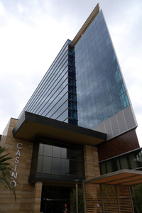
Posted by HunterAdmittedly, when I first saw the M Resort was I bit underwhelmed and I'm still not sure I like it as much as some others do. Still, I think the building is striking from some angles, such as this one.
Search
Categories
- About Vegas (38)
- ARIA (21)
- Atlantic City (49)
- Bellagio (90)
- Books (10)
- Boyd Gaming (57)
- Business of Gaming (870)
- Caesars/Harrah's (130)
- Casino Design (369)
- Casino Design Photo of the Week (12)
- CityCenter (158)
- Columbia Sussex (11)
- Condo-Hotels (15)
- Cosmopolitan (20)
- Detroit Casinos (10)
- Device Manufacturers and Games (6)
- Downtown Las Vegas (71)
- Dr. Dave Schwartz (68)
- Fontainebleau (30)
- Gaming Numbers (8)
- Genting (2)
- Interviews (13)
- iPhone (43)
- Landry's (1)
- Las Vegas Photography (98)
- Las Vegas Strip (740)
- Las Vegas/Casino History (3)
- Linq (4)
- Macau Casinos and Hotels (164)
- MGM Resorts International (418)
- Monte Carlo Fire (5)
- Online Gaming (2)
- Open Topics (20)
- Palazzo (59)
- Paolo Mello (1)
- Planet Hollywood (10)
- Podcasts (149)
- Poker (11)
- Press Releases (19)
- RateVegas.com (111)
- Reader Questions (3)
- Reader Reviews (54)
- Simpson on Vegas (38)
- SLS Las Vegas (2)
- Station Casinos (49)
- Strip Walk (32)
- Stripping (Reviews) (13)
- Travel (1)
- Trip Reports (95)
- Tropicana (4)
- Vegas Gang Podcast (115)
- Vegas Internet Mafia Picnic (7)
- Vegas Mate (21)
- Vegas Tips (9)
- Vegas Uncorked (6)
- VegasDelivered.com (1)
- Venetian/LV Sands (198)
- Video (9)
- Wynn Resorts (396)
Subscribe
- Grab our RSS Feed.
New to RSS? Learn more...
Recent Comments
- All Recent Comments on one page.
- Retail Design recently commented " I agree - it does look amazing from this angle but it doesn't look like a ..." in Casino Design Photo of the Week: M Resort
- Mike E recently commented "I love the way the building peeks out between the two mountains that introd..." in Casino Design Photo of the Week: M Resort
- John recently commented "I actually prefer to use the side entrance facing east at M...." in Casino Design Photo of the Week: M Resort
- chuckmonster recently commented "i love this building. it becomes almost invisible on a clear day. the "ca..." in Casino Design Photo of the Week: M Resort
- parchedearth recently commented "The M's modern design is what MGM is constantly trying and failing to achie..." in Casino Design Photo of the Week: M Resort
- Jeff Sommers recently commented "This Casino/Resort must be marketed towards the locals. I know from the man..." in Casino Design Photo of the Week: M Resort
Archives
- January 2018
- December 2012
- November 2012
- October 2012
- September 2012
- August 2012
- July 2012
- June 2012
- May 2012
- April 2012
- March 2012
- February 2012
- January 2012
- December 2011
- November 2011
- October 2011
- September 2011
- August 2011
- July 2011
- June 2011
- May 2011
- April 2011
- March 2011
- February 2011
- January 2011
- December 2010
- November 2010
- October 2010
- September 2010
- August 2010
- July 2010
- June 2010
- May 2010
- April 2010
- March 2010
- February 2010
- January 2010
- December 2009
- November 2009
- October 2009
- September 2009
- August 2009
- July 2009
- June 2009
- May 2009
- April 2009
- March 2009
- February 2009
- January 2009
- December 2008
- November 2008
- October 2008
- September 2008
- August 2008
- July 2008
- June 2008
- May 2008
- April 2008
- March 2008
- February 2008
- January 2008
- December 2007
- November 2007
- October 2007
- September 2007
- August 2007
- July 2007
- June 2007
- May 2007
- April 2007
- March 2007
- February 2007
- January 2007
- December 2006
- November 2006
- October 2006
- September 2006
- August 2006
- July 2006
- June 2006
- May 2006
- April 2006
- March 2006
- February 2006
- January 2006
- December 2005
- November 2005
- October 2005
- September 2005
- August 2005
- July 2005
- June 2005
- May 2005
- April 2005
- March 2005
- February 2005
- January 2005


Comments
This Casino/Resort must be marketed towards the locals. I know from the many visits to the strip, that I would never grab a cab and travel all the way to M Resort for any reason whatsoever! They need to start thinking about marketing this place like Hard Rock & Palms, the average Las Vegas customer is in town for a few days... why would anyone want to waste an entire afternoon/evening traveling in a cab to M Resort? No Fountains, Volcano, Mountain, Pirate ships, Rockstars or Celebrities.... come on M Resort, give us a reason to visit.
The M's modern design is what MGM is constantly trying and failing to achieve (e.g. MC and Luxor). The only design issue I see is that you need to loop around the property to get to the main hotel entrance on the south side (rather than being right off the main street on the north side).
The M is essentially the south Vegas equivalent of Red Rocks as a locals property, but additionally attracts CA visitors as they drive into or out of town on I15. They will never compete with the HRH or Palms.
i love this building. it becomes almost invisible on a clear day. the "casino" signage in the photo doesn't do the rest of the property justice though. looks cheap!
I actually prefer to use the side entrance facing east at M.
I love the way the building peeks out between the two mountains that introduce the final descent into the valley as you make your way up the I-15 northbound from California.
Jeff, I'd say M's #1 reason to visit is value. Looking beyond its room rates, It's top end strip quality at downtown prices. Should a once-year-visitor make a special trip? Probably not. But for a guy like me who could care less about Volcanoes, etc., I'd have no complaints vacationing there.
I agree - it does look amazing from this angle but it doesn't look like a 'casino'